01
DURATION
4 weeks
TOOLS
Surveys & interviews, user flows, personas, wireframes, high-fidelity designs
GOAL
Reduce the complexity of travel planning and eliminate the need for multiple apps
INTRO
VoyaJoy is a mobile app that allows users to centralize their entire trip planning in one place — from inspiration and planning to booking management and collaborative travel planning.


PROBLEM & OBJECTIVE
Travel planning is often time-consuming and mentally demanding. Users typically rely on multiple apps — such as navigation tools, blogs, and booking platforms — which leads to fragmented information, poor overview, and unnecessary stress. Many users spend several hours or even days preparing a single trip.
The objective of this project was to design an app that consolidates these scattered tasks into a single, user-centered experience.
USER RESEARCH & KEY INSIGHTS
To understand real user needs, I conducted anonymous surveys and personal interviews.
KEY INSIGHTS
From these findings, I identified the core pain points and defined clear design goals.
MAIN PAIN POINTS
TARGET GROUPS & PERSONAS
Based on the research data, I created three personas representing typical travel planners — from solo travelers to families and groups.
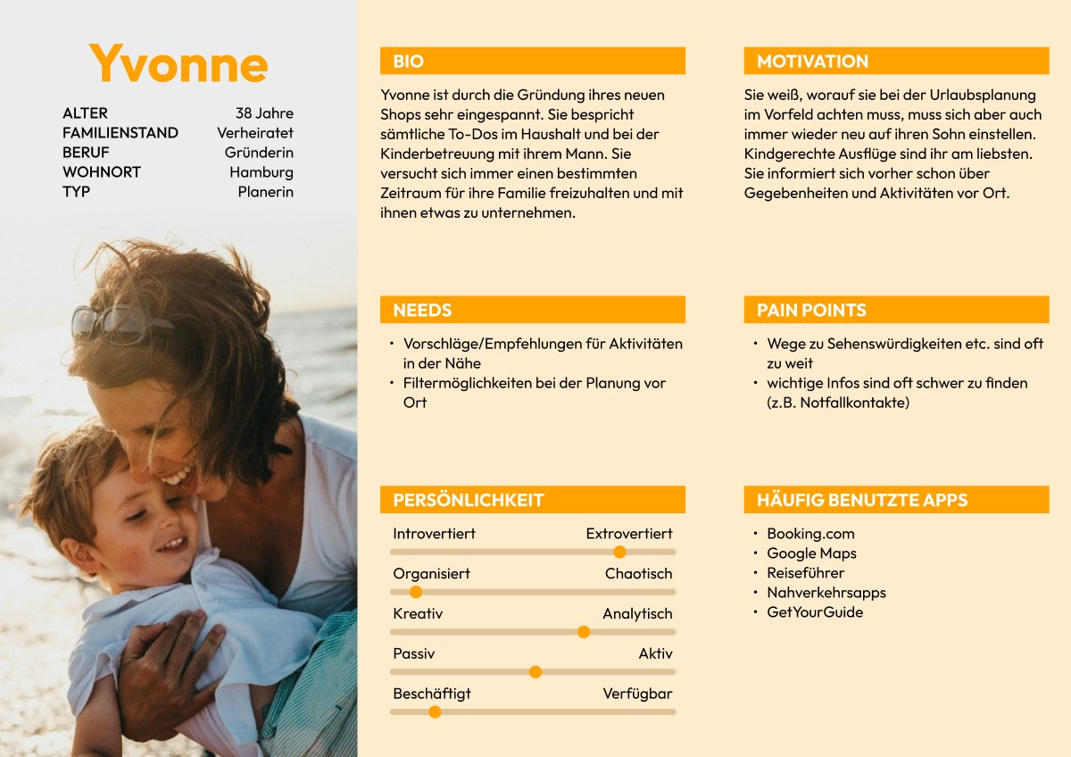


Throughout the design process, I primarily focused on group travelers, as they face the most complexity in coordination and communication.
DESIGN PROCESS DECISIONS

User Flow & Information Architecture
I mapped out key user flows to visualize core tasks and reduce unnecessary steps — particularly minimizing the need to switch between multiple apps.


Wireframes
Low-fidelity wireframes were used to quickly validate structure, functionality, and prioritization before moving into visual design.
Visual Design & UI Style
The visual design focuses on clarity and ease of use. A calm purple is used as the primary color to convey structure and a sense of organization, while a vibrant orange serves as an accent to draw attention to key actions. The typeface Inter was chosen for its excellent readability, especially on mobile devices.
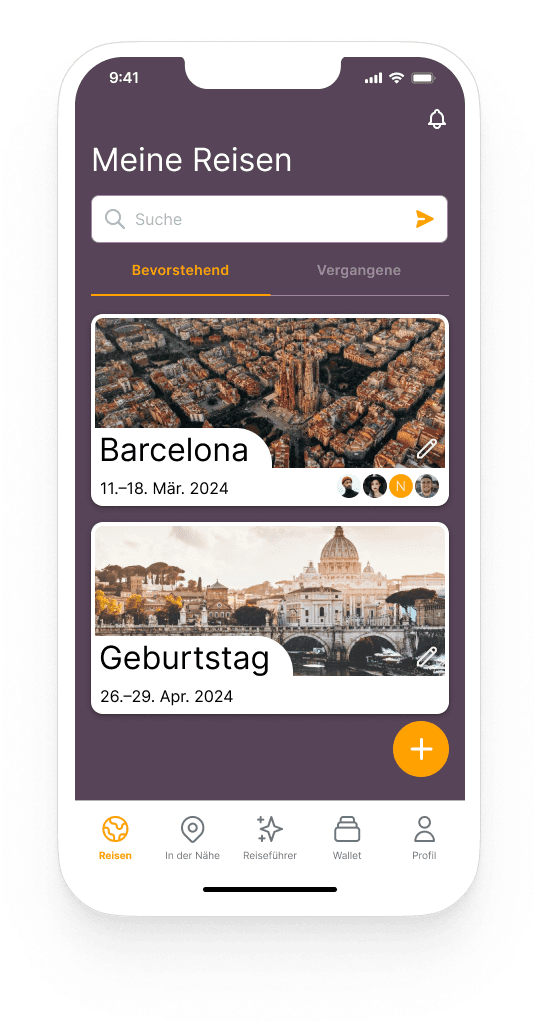
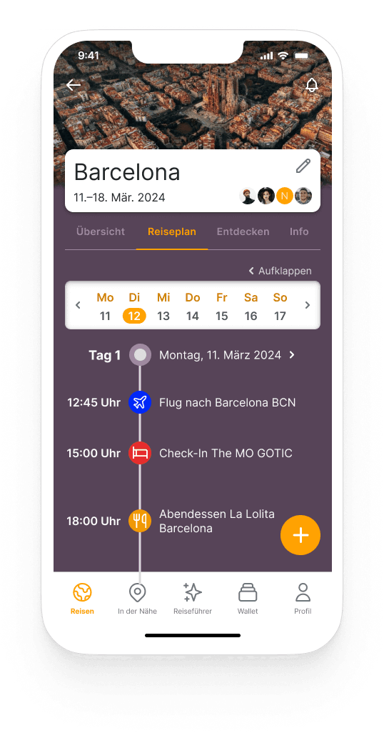
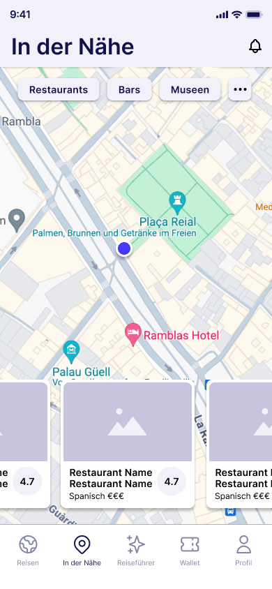
SOLUTIONS & KEY FRAMES
THE FINAL APP CONECEPT INCLUDES
OUTCOME & VALUE
Although this was a concept project without live user testing, the case study still shows a solid understanding of UX. Design decisions were guided by qualitative research and thoughtfully translated into practical, user-centered UI solutions. It also highlights a clear grasp of the problem space, with the solution focusing on real user pain points like planning complexity, scattered information, and the challenges of coordinating groups.


LEARNINGS & NEXT STEPS
This project reinforced how important user research is for uncovering real needs instead of designing based on assumptions. It also showed that clear prioritization can greatly reduce how complex a product feels to users.
As a next step, I would run usability tests with real users to validate the interactions and overall flow. I’d also explore adding an in-app messaging feature to make group communication easier, and use A/B testing to further refine UI elements and user flows.
